American Institutes for Research
The American Institutes for Research (AIR) is a leading behavioral and social science research organization that uses rigorous evidence to help create a better, more equitable world. As they entered their 75th year they embarked on a rebranding process to position AIR as a knowledgable, collaborative bridge-builder.
The new mark represents the many dual elements we uncovered through research and conversations: their focus on knowledge & action, community & leadership. The importance of internal & external teams, the past & the future. The negative space within the diamond represents the bridge connecting these elements and creating a stronger whole.
The previous logo was an old fashioned idea of “research” with a gray and blue column that was difficult to reproduce at small sizes. With the growth of their clients, and new acquisitions, the full name “American Institutes for Research” was also no longer appropriate. When seen within the peer landscape the logo lacked the energy and innovation that staff felt was at their core.
After landing on the mark and working with renowned typographer Jesse Ragan on the “AIR” logotype, I moved into creating moodboard options for the visual identity and website.
Moodboard Concept 1 | Fluid, Compassionate, Visionary
Moodboard Concept 2 | Geometric, Collaborative, Direct
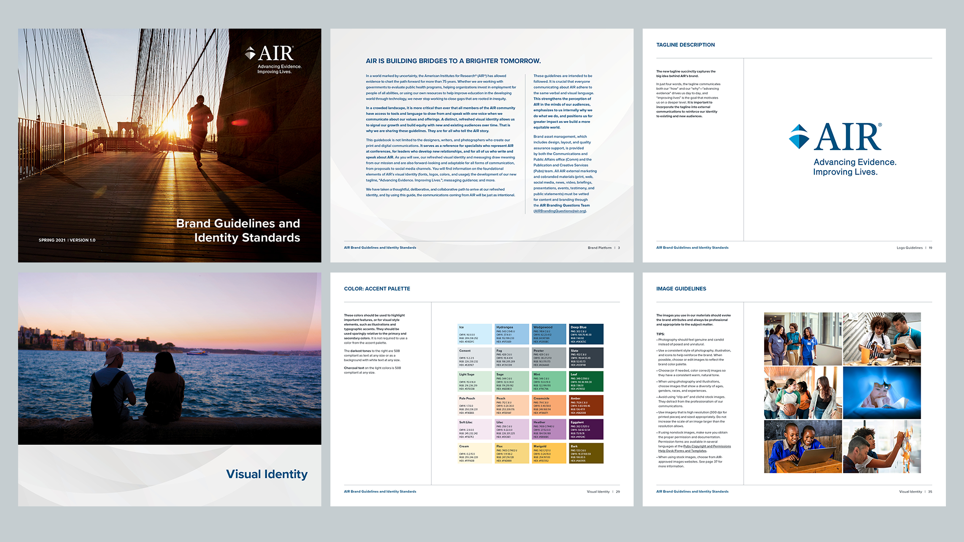
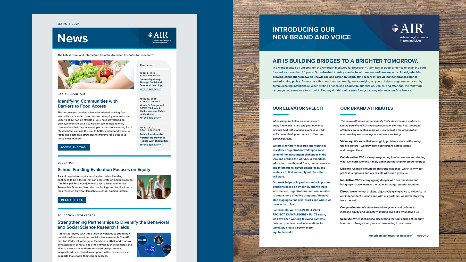
The final design system features a fresh and bright identity using overlapping curves and energetic images to reinforce AIR’s positive, collaborative spirit. To help with deploying and maintaining the new brand across their marketing and communications departments I created a comprehensive brand guide which included sections for the new brand platform, detailed logo guidelines, and visual identity standards.
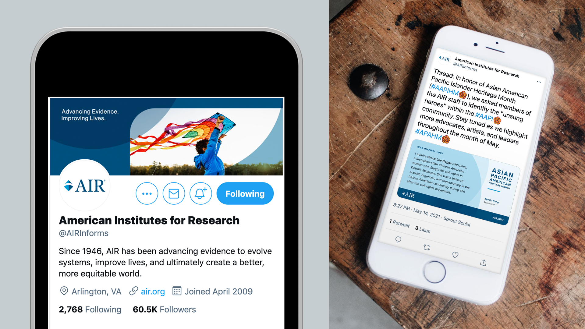
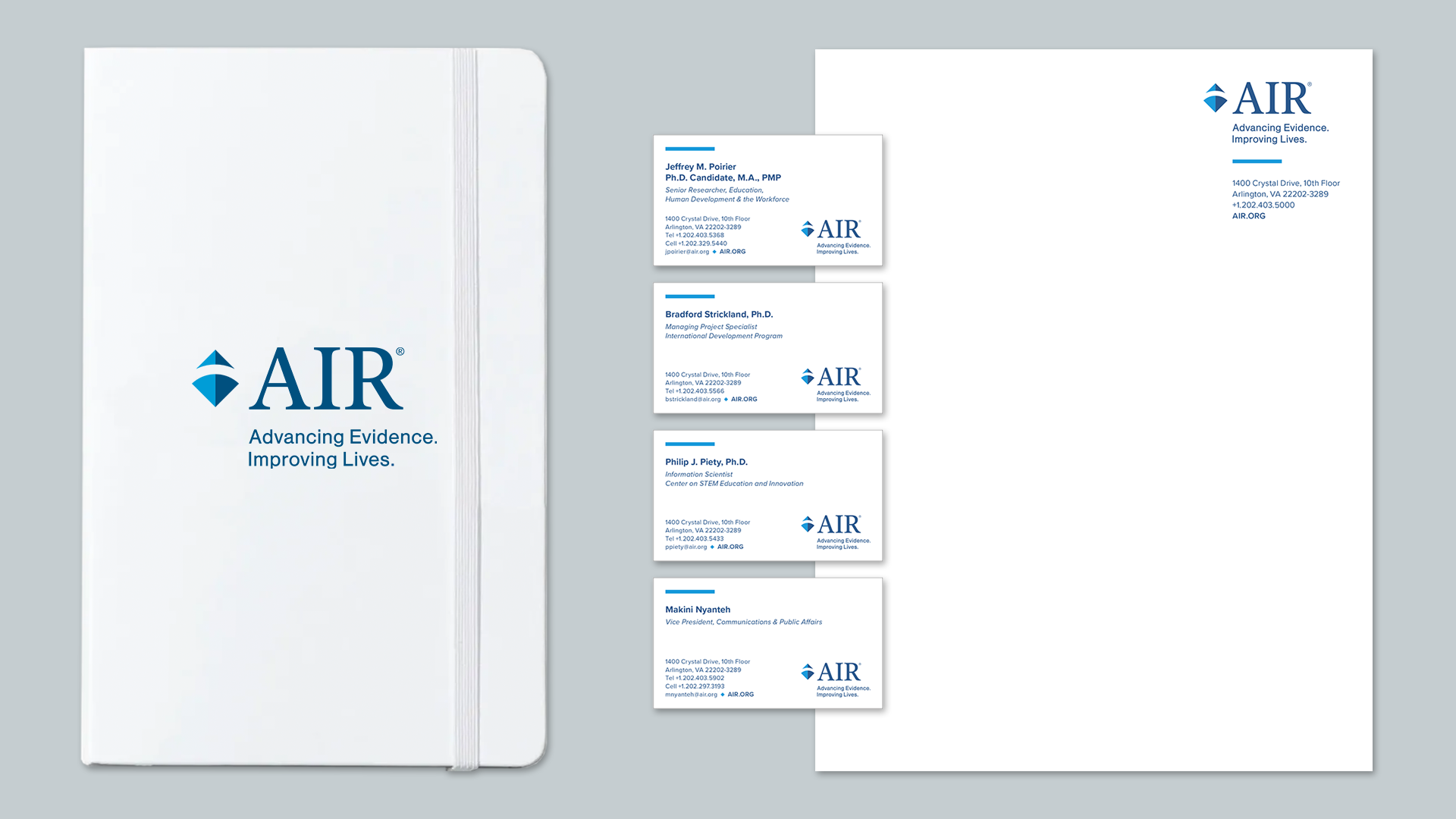
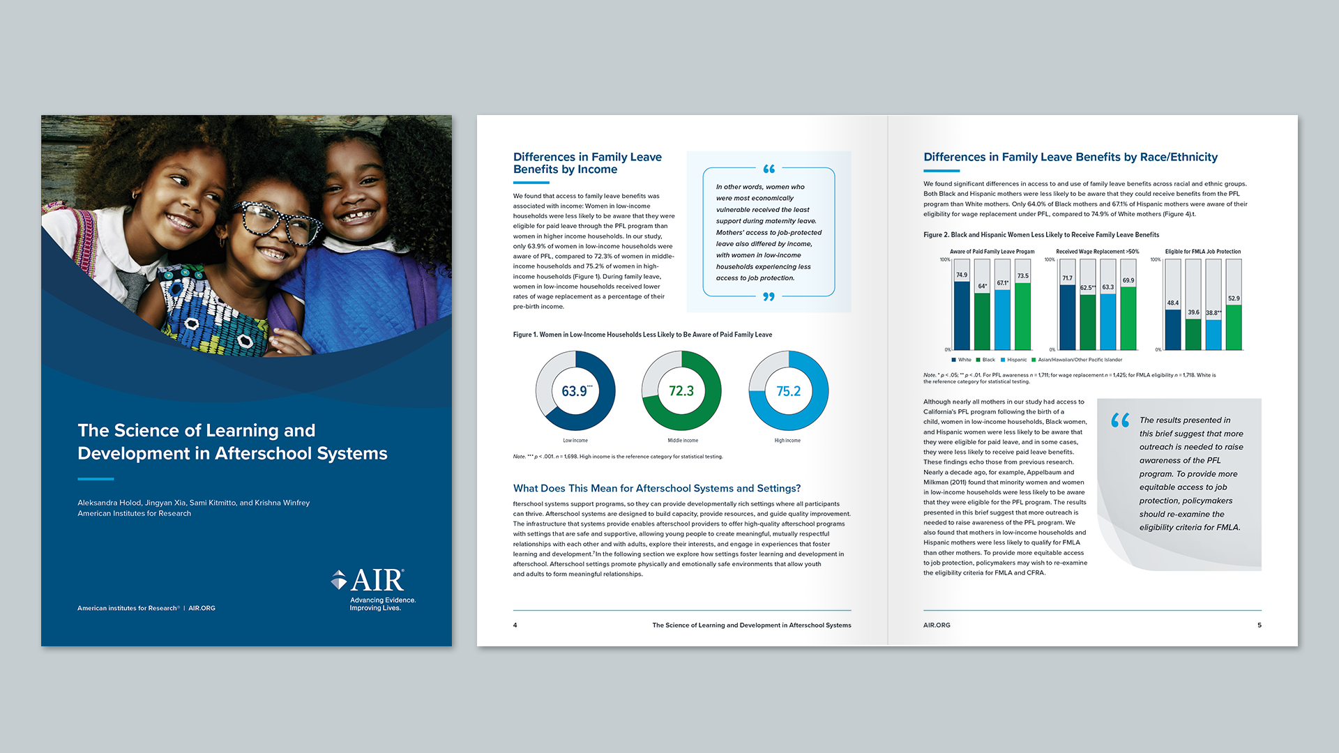
I also created a large array of templates including stationery, social media assets, reports, briefs, e-newsletters, and PowerPoint presentations.
